Understanding Iteration Burnup Charts in Agile
Iteration Burnup Charts are another crucial tool in Agile project management, often used alongside burndown charts to provide complementary insights. Unlike burndown charts, which track work remaining, burnup charts focus on work completed over time, showcasing progress toward a sprint goal.
What is an Iteration Burnup Chart?
An Iteration Burnup Chart is a simple line chart with:
- X-axis: The days in the sprint or iteration (time).
- Y-axis: The cumulative amount of work completed, typically measured in story points, hours, or tasks.
The chart typically includes:
- Total Scope Line: A horizontal line representing the total work planned for the sprint.
- Work Completed Line: A line plotting the cumulative work completed daily.
How to Use an Iteration Burnup Chart
- Track Daily Progress: Teams update the chart daily by adding completed work to the cumulative total.
- Visualize Scope Changes: Adjustments to the total scope are reflected by moving the Total Scope Line.
- Identify Trends: Comparing progress against the Total Scope Line helps teams assess if they’re on track to meet sprint goals.
- Facilitate Communication: Use the chart to share progress transparently with stakeholders and discuss any potential issues.
Practical Example of Iteration Burnup Chart Usage
Scenario: A Sprint in a Mobile App Development Project
- Team Goal: Build a new feature for managing user profiles.
- Sprint Duration: 10 days.
- Planned Work: 50 story points divided into tasks like UI design, API creation, and testing.
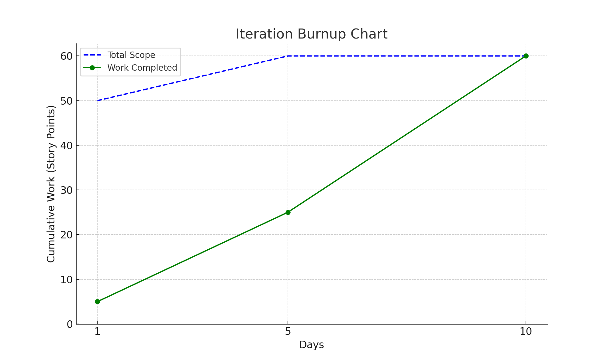
Day 1: The sprint starts, and the team completes 5 story points focused on UI design.
Day 5: Midway through the sprint, 25 story points are completed. However, additional requirements increase the total scope by 10 story points.
Day 10: The team completes the remaining tasks, achieving 60 story points in total.
The Iteration Burnup Chart illustrates the cumulative progress and the adjustment in total scope, highlighting how the team adapted to changes while meeting the sprint goal.
Benefits of Iteration Burnup Charts
- Transparency: Teams and stakeholders see not just progress but also scope changes over time.
- Motivation: Tracking cumulative achievements can boost team morale.
- Adaptability: The chart highlights scope adjustments, helping teams remain aligned with project priorities.
Sample Iteration Burnup Chart
Below is a visual representation of the described scenario:
The Total Scope Line remains constant unless new tasks are added. The Work Completed Line shows steady progress toward the goal, reflecting any changes in pace or scope.
Key Considerations When Using Iteration Burnup Charts
- Update Daily: Maintain accuracy by logging progress at the end of each day.
- Reflect Scope Changes: Clearly document and adjust for any changes to planned work.
- Highlight Achievements: Use the chart to celebrate milestones and motivate the team.
Conclusion
Iteration Burnup Charts provide a clear and motivational view of team progress while accommodating changes in scope. They complement burndown charts by focusing on achievements rather than just remaining work. By leveraging burnup charts, Agile teams can enhance communication, maintain focus on goals, and adapt effectively to evolving requirements.
